Pivot Charts and Visual Reporting
Svep för att visa menyn
Pivot Tables help you analyze data. Pivot Charts help you communicate it. In real reporting environments, accountants and analysts are expected not only to calculate results but to present them clearly to management. This chapter focuses on turning Pivot analysis into visual insights.
Why Pivot Charts Matter in Practice
Executives rarely read large tables. They want to understand quickly:
- Which category performs best?
- How is revenue distributed?
- Whether performance is balanced or concentrated?
- How do trends evolve over time?
What Is a Pivot Chart?
A Pivot Chart is directly connected to a Pivot Table. Key difference from regular charts:
- It updates automatically when the Pivot changes;
- It responds to slicers and timelines;
- It reflects grouping and filtering instantly.
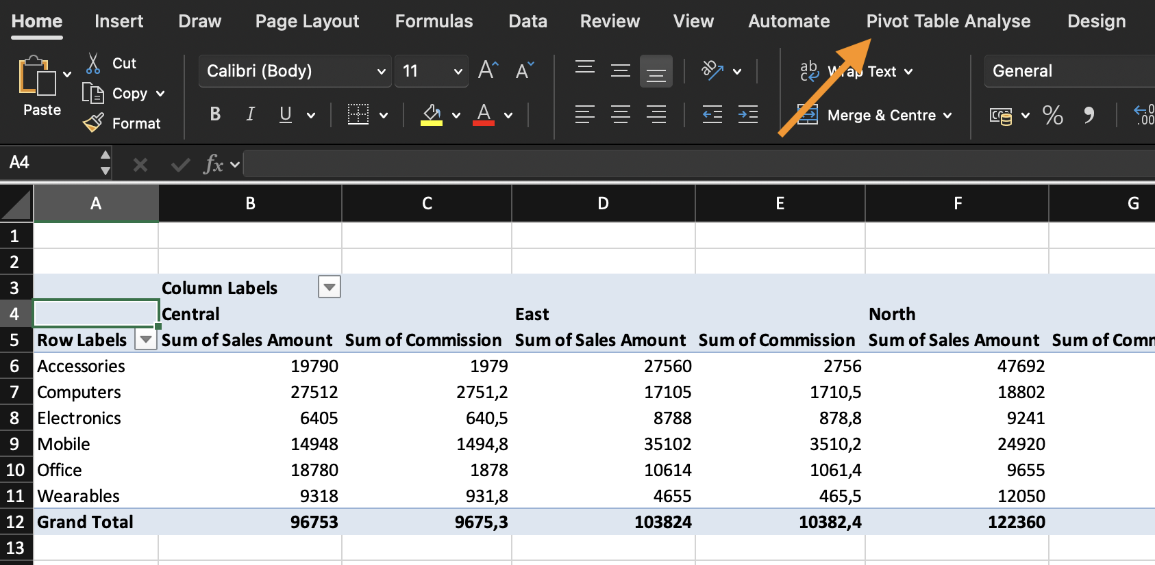
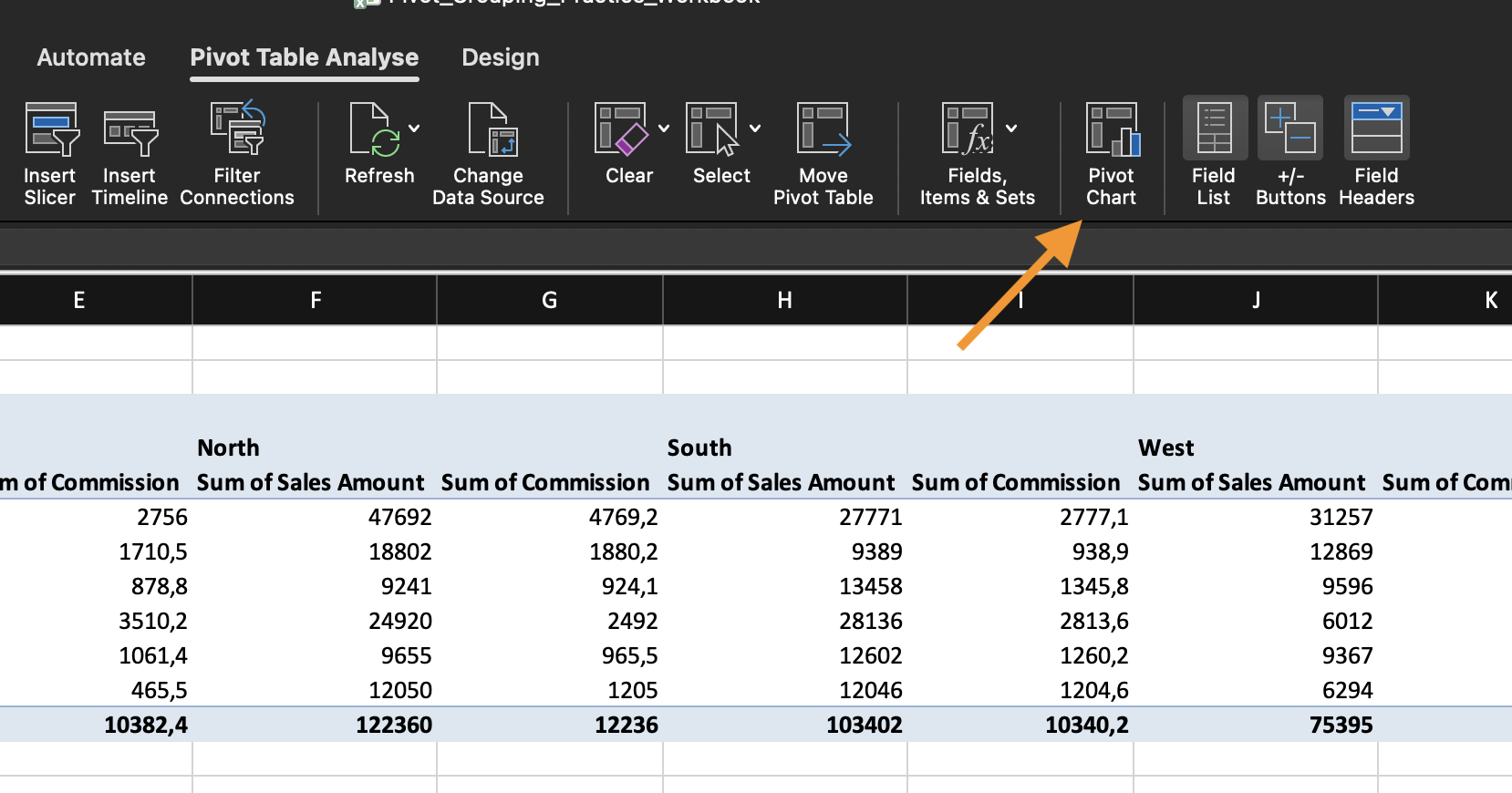
How to Insert a Pivot Chart
- Click inside a Pivot Table;
- Go to PivotTable Analyze;
- Click PivotChart;
- Choose a chart type.
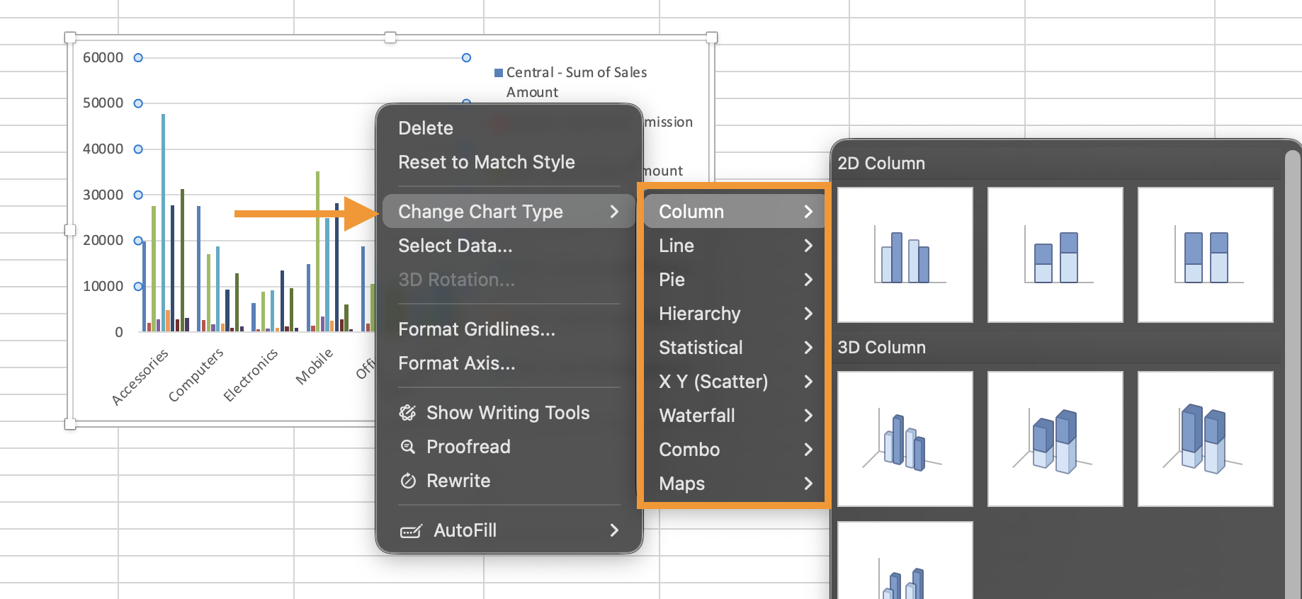
Choosing the Right Chart Type
Avoid 3D charts and excessive styling in financial reporting. Clarity is more important than decoration.
Task
a) Create Pivot Table #1:
- Rows: Category;
- Values: Sum of Revenue.
Insert a Column Pivot Chart based on this Pivot Table.
b) Create Pivot Table #2:
- Rows: Date (grouped by Month);
- Values: Sum of Revenue.
Insert a Line Pivot Chart for monthly trend.
c) Add Slicer for Region and Timeline for Date;
d) Connect slicers to both Pivot Tables.
Final Scenario:
- Filter Timeline to Quarter 2 only;
- Select Regions: East, South, West;
- Identify which category performs best under these conditions.
Tack för dina kommentarer!
Fråga AI
Fråga AI

Fråga vad du vill eller prova någon av de föreslagna frågorna för att starta vårt samtal
