Seção 4. Capítulo 1
single
 Heatmap
Deslize para mostrar o menu
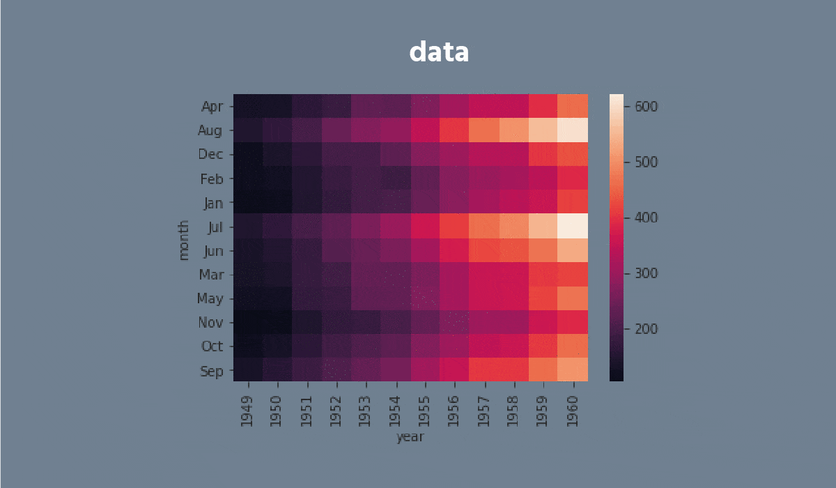
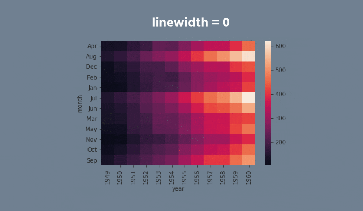
A heatmap is a plot of rectangular data as a color-encoded matrix. As a parameter, it takes a 2D dataset. That dataset can be coerced into an ndarray.
This is a great way to visualize data because it can show the relation between variables, including time. For instance, the number of flights through the years.


Tarefa
Swipe to start coding
- Set the
'ticks'style with the'seagreen'figure.facecolor. - Create the
heatmapusing theseabornlibrary:
- Add the data for the
heatmap. You only need to input the name of the DataFrame (withoutdata = ...); - Set the
'viridis'cmapparameter; - Add the
annotparameter; - Set the
fmtparameter equals the'0.99g'; - Set the
linecolorparameter equals the'plum'; - Display the plot.
Solução
Tudo estava claro?
Obrigado pelo seu feedback!
Seção 4. Capítulo 1
single
Pergunte à IA
Pergunte à IA

Pergunte o que quiser ou experimente uma das perguntas sugeridas para iniciar nosso bate-papo
