single
Gráfico de Pizza
Deslize para mostrar o menu
Gráfico de pizza é um gráfico que utiliza um círculo dividido em fatias (segmentos) para representar a proporção numérica (distribuição percentual) de dados nominais.
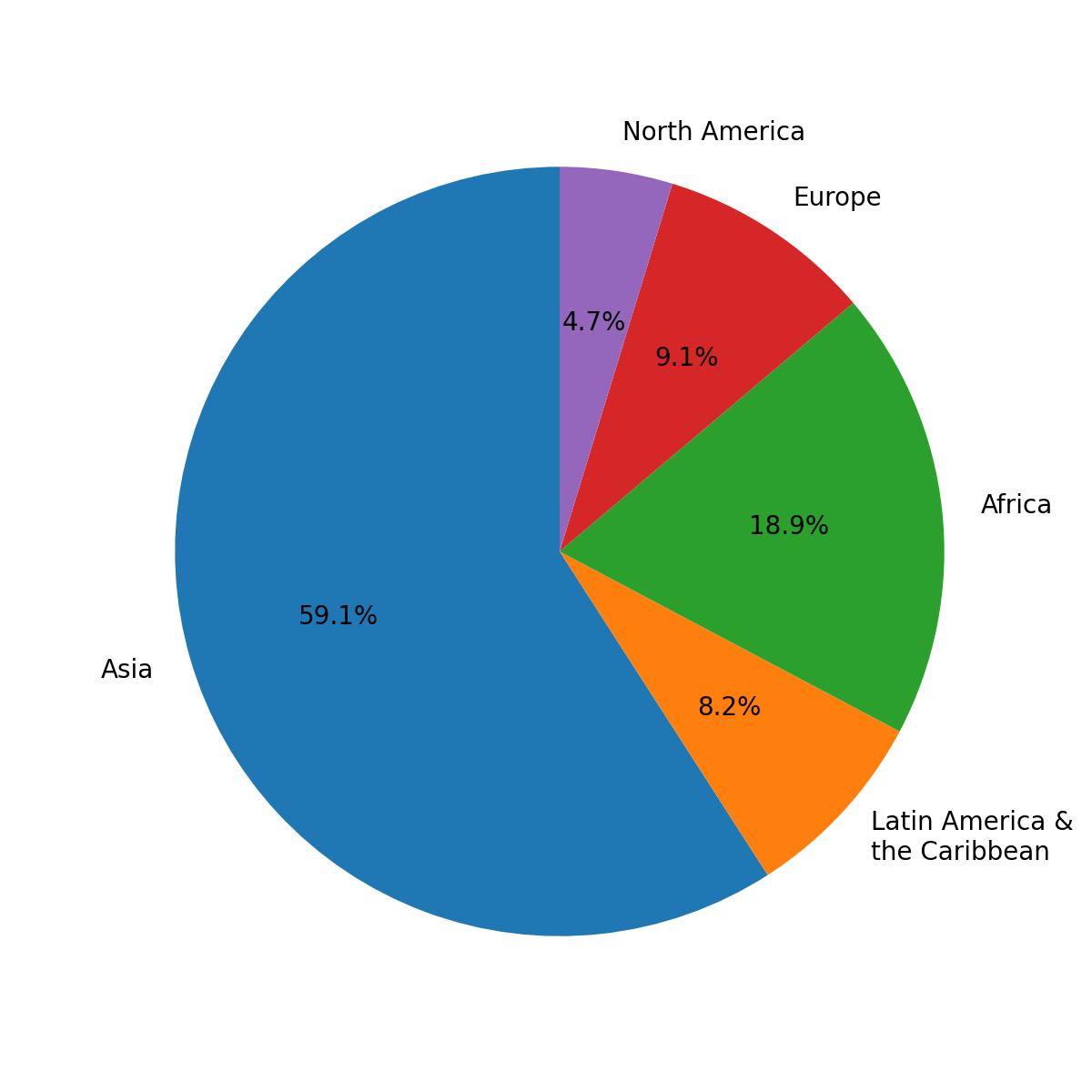
Este gráfico representa a distribuição percentual da população por região.
Apesar de serem visualmente atraentes, os gráficos de pizza devem ser evitados na maioria dos casos, pois distorcem a visualização dos dados. Uma categoria com muitos registros parecerá ainda maior, enquanto uma categoria com poucos registros parecerá ainda menor.
Gráfico de Pizza com Rótulos
Utilize a função pie() do módulo pyplot para criar um gráfico de pizza. Seu único parâmetro obrigatório são os dados (x).
O parâmetro labels atribui rótulos a cada segmento e deve ser uma sequência de strings.
123456import pandas as pd url = 'https://staging-content-media-cdn.codefinity.com/courses/47339f29-4722-4e72-a0d4-6112c70ff738/population.csv' population_df = pd.read_csv(url) print(population_df)
Este DataFrame contém a população de cada região.
123456import matplotlib.pyplot as plt import pandas as pd population_df = pd.read_csv('https://staging-content-media-cdn.codefinity.com/courses/47339f29-4722-4e72-a0d4-6112c70ff738/population.csv') # Creating a pie chart and setting the labels for each region plt.pie(population_df['Population'], labels=population_df['Region']) plt.show()
A função pie() foi chamada com a Series de dados populacionais passada como parâmetro x, e a Series com os nomes das regiões fornecida como rótulos dos segmentos usando o parâmetro labels.
Adicionando Percentuais
Para exibir o percentual de cada segmento, utilize o parâmetro autopct na função pie(). Este parâmetro controla como os percentuais são formatados e exibidos dentro do gráfico.
Ele aceita uma string de formatação ou uma função. Aqui, o foco está no uso de uma string de formatação.
123456789import matplotlib.pyplot as plt import pandas as pd population_df = pd.read_csv('https://staging-content-media-cdn.codefinity.com/courses/47339f29-4722-4e72-a0d4-6112c70ff738/population.csv') # Setting the label for each region and its percentage plt.pie(population_df['Population'], labels=population_df['Region'], autopct='%1.1f%%') plt.show()
String de Formatação
A string %1.1f%% formata os valores percentuais exibidos no gráfico de pizza.
%findica que o valor é um número de ponto flutuante;.1especifica um dígito após o ponto decimal;- O duplo
%garante que o símbolo de porcentagem apareça no resultado.
Se desejar explorar mais parâmetros, consulte a documentação do pie().
Deslize para começar a programar
- Utilize a função correta para criar um gráfico de pizza.
- Utilize
incomescomo os dados para o gráfico de pizza (primeiro argumento). - Defina os rótulos como
namesatravés do segundo argumento. - Defina o formato da porcentagem como um número de ponto flutuante com uma casa decimal através do terceiro argumento.
Solução
Obrigado pelo seu feedback!
single
Pergunte à IA
Pergunte à IA

Pergunte o que quiser ou experimente uma das perguntas sugeridas para iniciar nosso bate-papo
