Section 2. Chapitre 2
single
Kdeplot
Glissez pour afficher le menu
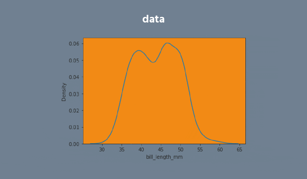
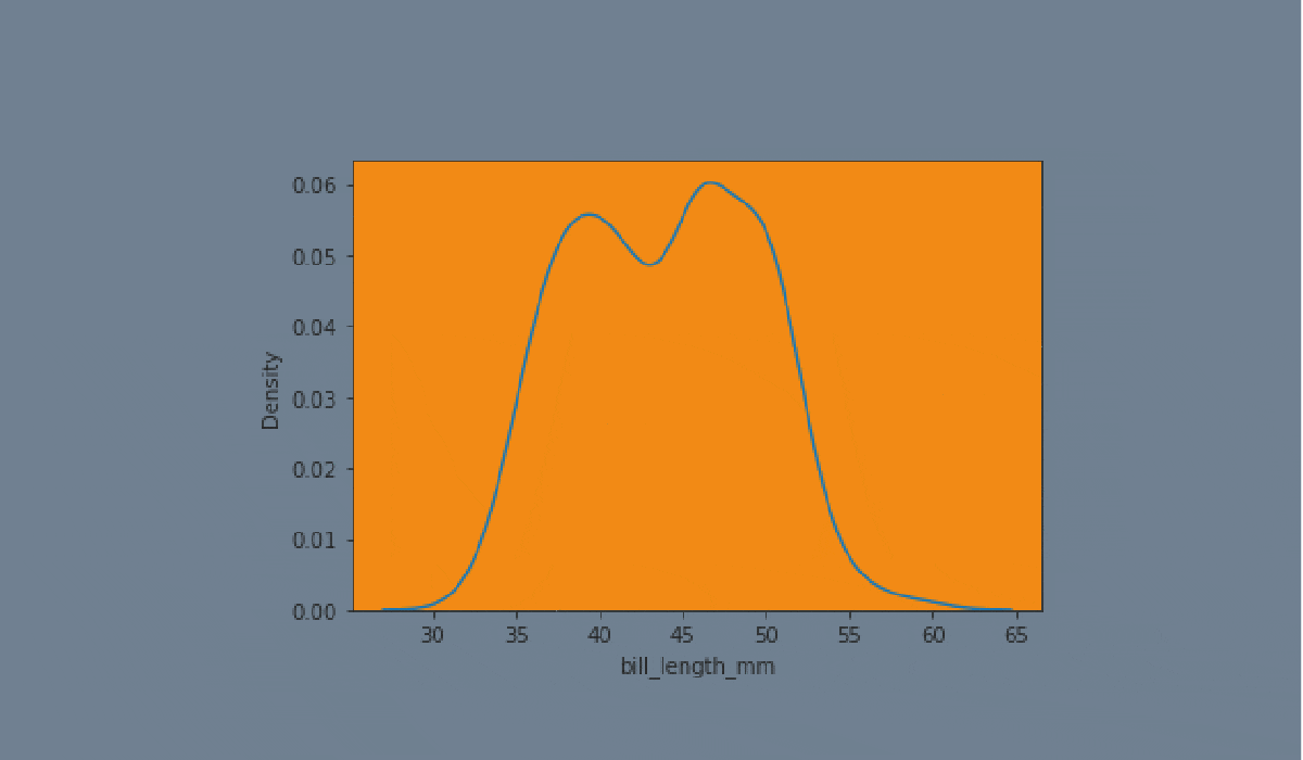
A kdeplot plot is a method for visualizing the distribution of observations in a dataset analogous to a histogram. KDE represents the data using a continuous probability density curve in one or more dimensions.


Tâche
Glissez pour commencer à coder
- Create the kdeplot using the
seabornlibrary:
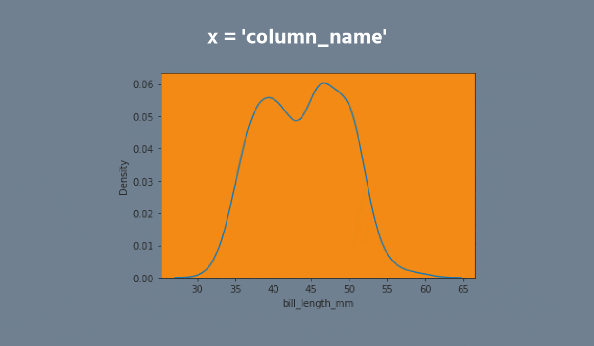
- Set the
xparameter equals the'max_temp'; - Set the
hueparameter equals the'month'; - Set the
multipleparameter equals the'stack'; - Disable the
legend; - Add the filling;
- Set the data;
- Display the plot.
Solution
Tout était clair ?
Merci pour vos commentaires !
Section 2. Chapitre 2
single
Demandez à l'IA
Demandez à l'IA

Posez n'importe quelle question ou essayez l'une des questions suggérées pour commencer notre discussion
