single
Defining the Number of Clusters
Glissez pour afficher le menu
As we mentioned before, there are no correct solutions to unsupervised learning problems. We can predict the number of clusters by watching the scatter plot, but in real life, data usually has more than 2 dimensions. For example, if you have 4 columns, then there are 6 possible 2-D scatter plots. And you do not want to spend your time watching all of the charts.
In the previous chapter, we mentioned that the K-Means algorithm runs until the variance between the points within each cluster is minimized. So, it sounds like quality metrics, doesn't it? But not everything is so simple. If you put each point in a separate cluster, then all the variances will be zeros, since the variance of the constant (which is a single point) is zero. Well, in that case, clustering makes no sense at all. So, how should we choose what number of clusters we want to consider?
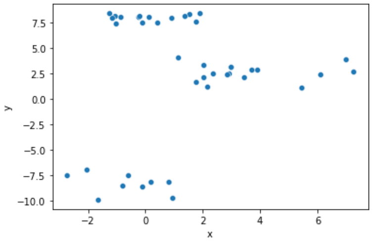
Probably the simplest approach is to build a line plot representing the variances for each number of clusters. For example, let's build such a plot for the data from the previous chapter. Below is the scatter plot of data points.
The desired variances can be extracted by applying the .inertia_ method to the KMeans object after fitting. We will use for loop to iterate over the range object which will represent a different number of clusters and add the variance value to the list.
In this and future chapters, we will use the
range()function to generate the list of the integer numbers. We will pass two parameters within this function:startandend- this will generate integer numbers fromstarttoend - 1.
12345678910111213141516171819202122# Import the libraries import pandas as pd from sklearn.cluster import KMeans import matplotlib.pyplot as plt import seaborn as sns # Read the data data = pd.read_csv('https://codefinity-content-media.s3.eu-west-1.amazonaws.com/138ab9ad-aa37-4310-873f-0f62abafb038/model_data1.csv') # Creating lists clusters = range(2, 9) variances = [] # Fitting model to different number of clusters for i in clusters: model = KMeans(n_clusters = i) model.fit(data) variances.append(model.inertia_) # Building lineplot for variances sns.lineplot(x = clusters, y = variances) plt.show()
So, how should you interpret this chart? It is believed that the optimal number of clusters is the number at which the decrease of variance is much less than in the previous steps. In the chart above there was a significant drop between 2 and 3, and much less between 3 and 4. After 4 there are no such significant drops that were left to 4. So we confirmed that the optimal number of clusters for the points above is 3. Now it's your turn!
Glissez pour commencer à coder
Given the 2-D set of points data. The scatter plot visualizing the distribution is below.
You need to build the same line plot representing the dependence of the total within sum of squares vs the number of clusters. Follow the next steps:
- Import
KMeansfromsklearn.cluster. - Create a
rangeobject with integer numbers from 2 to 8 and save it within theclustersvariable. - Iterate over all the values of
clusters. Within theforloop:
- Create a
KMeansmodel object with the number of clustersiassigned tomodel. - Fit the
datatomodel. - Add
.inertia_attribute ofmodeltovarianceslist. This will add the value of the total within sum of squares.
- Build
seabornlineplotwithclusterson the x-axis, andvarianceson the y-axis. Do not forget to apply.show()method ofplt!
Solution
Merci pour vos commentaires !
single
Demandez à l'IA
Demandez à l'IA

Posez n'importe quelle question ou essayez l'une des questions suggérées pour commencer notre discussion
