Layout with Flexbox
Swipe um das Menü anzuzeigen
React Native uses Flexbox to control layout.
Flexbox helps you position elements on the screen.
The most important properties are:
flexDirection: layout direction;justifyContent: alignment on the main axis;alignItems: alignment on the cross axis.
Example:
import { View, Text, Image, StyleSheet } from 'react-native';

export default function App() {
  return (
    <View style={styles.container}>
      <Text style={styles.title}>Profile</Text>

      <View style={styles.row}>
        <Image
          source={{ uri: 'https://i.pravatar.cc/150' }}
          style={styles.avatar}
        />

        <View>
          <Text style={styles.name}>Alex Johnson</Text>
          <Text>Frontend Developer</Text>
        </View>
      </View>
    </View>
  );
}

const styles = StyleSheet.create({
  container: {
    padding: 20
  },
  title: {
    fontSize: 20,
    marginBottom: 10
  },
  row: {
    flexDirection: 'row',
    alignItems: 'center'
  },
  avatar: {
    width: 80,
    height: 80,
    marginRight: 10
  },
  name: {
    fontSize: 18
  }
});
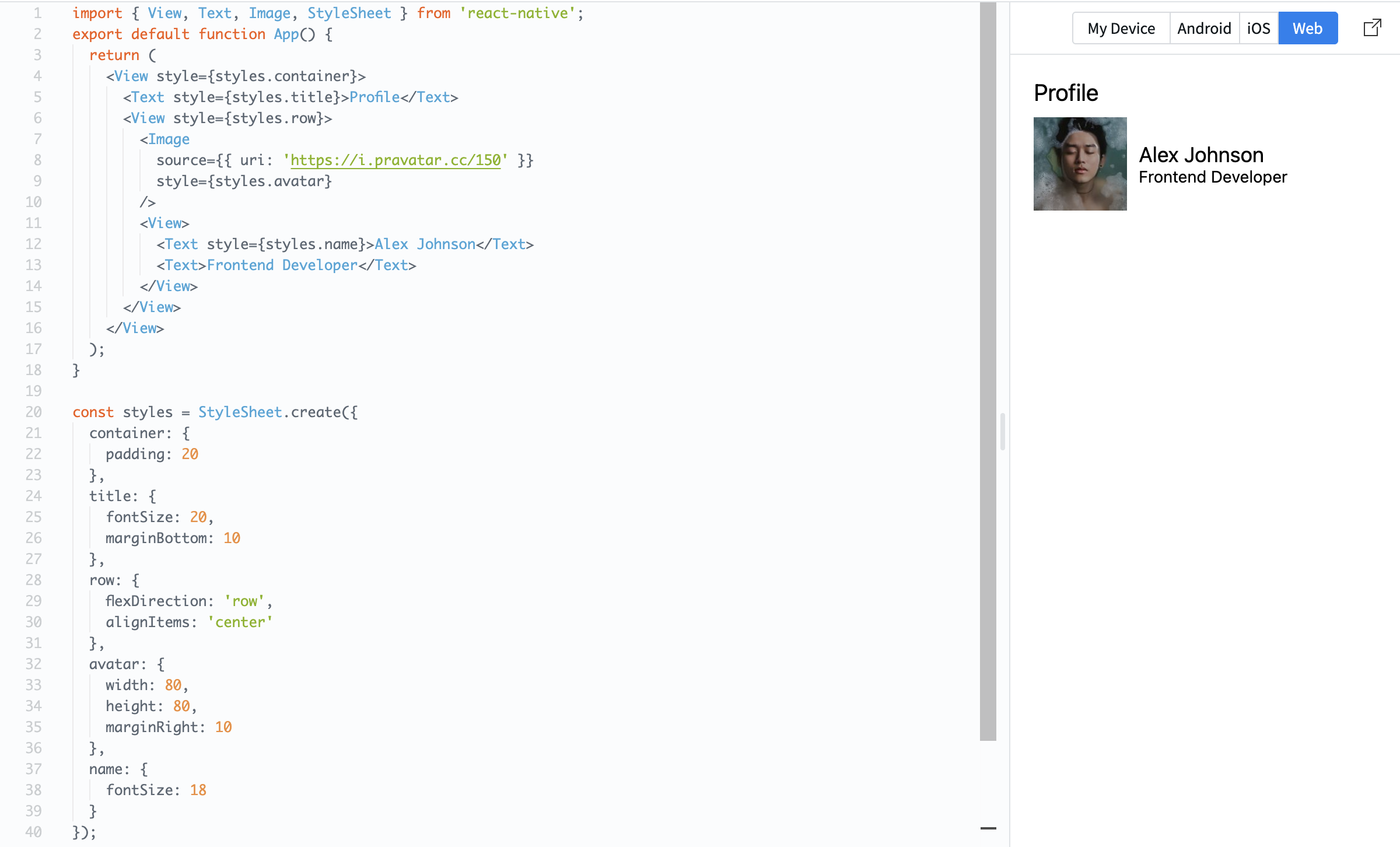
Here, flexDirection: 'row' places items side by side, and alignItems: 'center' aligns them vertically.
Flexbox is essential because it controls how your layout looks on different screen sizes.
Danke für Ihr Feedback!
Fragen Sie AI

Fragen Sie AI

Fragen Sie alles oder probieren Sie eine der vorgeschlagenen Fragen, um unser Gespräch zu beginnen
Layout with Flexbox
React Native uses Flexbox to control layout.
Flexbox helps you position elements on the screen.
The most important properties are:
flexDirection: layout direction;justifyContent: alignment on the main axis;alignItems: alignment on the cross axis.
Example:
import { View, Text, Image, StyleSheet } from 'react-native';

export default function App() {
  return (
    <View style={styles.container}>
      <Text style={styles.title}>Profile</Text>

      <View style={styles.row}>
        <Image
          source={{ uri: 'https://i.pravatar.cc/150' }}
          style={styles.avatar}
        />

        <View>
          <Text style={styles.name}>Alex Johnson</Text>
          <Text>Frontend Developer</Text>
        </View>
      </View>
    </View>
  );
}

const styles = StyleSheet.create({
  container: {
    padding: 20
  },
  title: {
    fontSize: 20,
    marginBottom: 10
  },
  row: {
    flexDirection: 'row',
    alignItems: 'center'
  },
  avatar: {
    width: 80,
    height: 80,
    marginRight: 10
  },
  name: {
    fontSize: 18
  }
});
Here, flexDirection: 'row' places items side by side, and alignItems: 'center' aligns them vertically.
Flexbox is essential because it controls how your layout looks on different screen sizes.
Danke für Ihr Feedback!
