single
Dendrograms
Swipe um das Menü anzuzeigen
In the previous sections, we used two metrics to help us to define the number of clusters in data. These were the total within sum of squares, and silhouette score. Both of the methods equally work either with K-Means, either K-Medoids methods. But these are not applicable for Hierarchical clustering.
As was mentioned in the previous chapter, at each step some metric is used to decide whether the clusters should be merged or not. This process can continue up to one single cluster with all the points. So, how to choose where should we stop? The dendrogram is the solution! The dendrogram visualizes the distances between the points.
To build a dendrogram in Python, firstly you need to calculate all the distances between the points of your data. It can be easily done with the linkage function from the scipy.cluster.hierarchy library. This function requires the numerical data matrix (DataFrame) as the first parameter. Also, there is parameters method (by default 'single') and metric (by default 'euclidean') that can be changed, but we will consider that later. After computing the distances, you can visualize them by using the dendrogram function from the same library (scipy.cluster.hierarchy) passing the distances matrix (computed with the linkage function) as a parameter. This function also has multiple additional parameters that can be changed, but they will be considered later. Watch out for the example below!
1234567891011121314# Import the libraries import pandas as pd import matplotlib.pyplot as plt from scipy.cluster.hierarchy import linkage, dendrogram # Read the data data = pd.read_csv('https://codefinity-content-media.s3.eu-west-1.amazonaws.com/138ab9ad-aa37-4310-873f-0f62abafb038/train_data1.csv') # Compute the distances dist = linkage(data) # Build the dendrogram dendrogram(dist) plt.show()
How should you read this plot? The division there was so obvious that algorithms automatically colored the nodes with 2 colors. The height of the vertical line - is the distance between points and/or clusters. The higher it is, the more distinct clusters are. There you can see that the maximum distances within orange and green areas are 1, while the distance between them significantly higher. Remember, there is no correct answer to the clustering problems. The labels on the x-axis are the values' indices, and they can be customized.
Wischen, um mit dem Codieren zu beginnen
Given the 2-D set of points data (training dataset). The scatter plot is shown below.
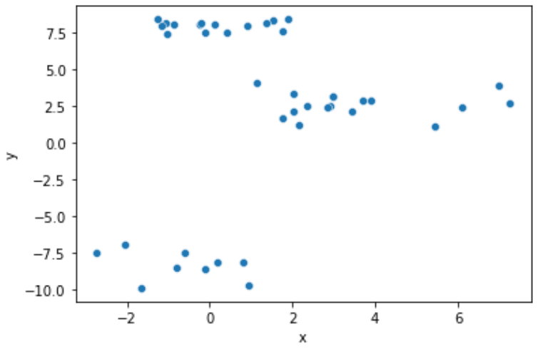
Build the dendrogram for this data. Follow the next steps:
- Import
dendrogramandlinkagefromscipy.cluster.hierarchy. - Compute the distances of
datapoints using thelinkagefunction. Save the result within thedistvariable. - Build a dendrogram visualizing the
dist. Do not set any additional parameters.
Lösung
Danke für Ihr Feedback!
single
Fragen Sie AI
Fragen Sie AI

Fragen Sie alles oder probieren Sie eine der vorgeschlagenen Fragen, um unser Gespräch zu beginnen
