Section 6. Chapter 7
Adding Trendlines to Excel Charts
Swipe to show menu
Trendlines help identify patterns and highlight overall trends in data.
In this lesson, you will learn how to add a trendline to a chart and customize its color, width, and style to make trends clearer and easier to interpret.
Key Points
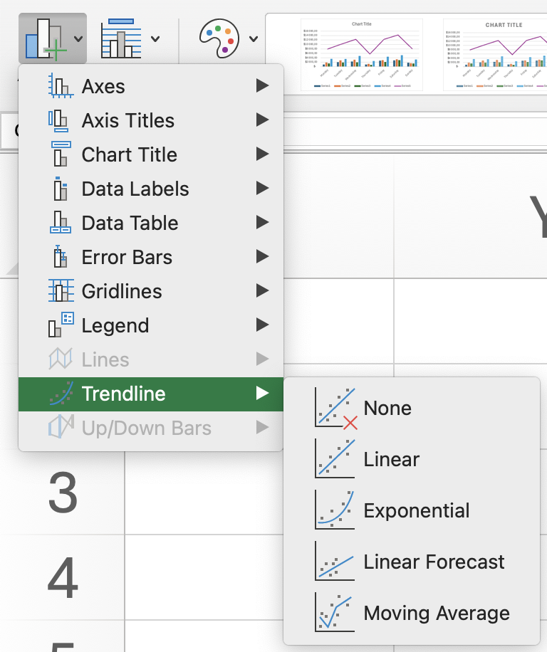
- Add a Trendline using the Chart Design tab → Chart Layouts group → Add Chart Element → Trendline (e.g., Linear);
- Open Format Trendline by right-clicking the trendline to customize its settings;
- Adjust the Forecast Forward value to extend the trendline into future periods;
- Change the trendline type to Polynomial and set the required Order;
- Modify the line color and style in the formatting options to make the trendline more visible.
Task
Swipe to start coding
Add a linear trendline to the Income vs Expenses column chart.
- Excel workflow: click the column chart →
Chart Designtab →Add Chart Element→Trendline→Linear→Income. - Platform workflow: click the chart → click the button in the top-right corner → open the chart panel →
Setuptab →Trendlinesection →Add Trendline→ selectIncome.
 Switch to desktop for real-world practiceContinue from where you are using one of the options below
Everything was clear?
Thanks for your feedback!
Section 6. Chapter 7
Ask AI

Ask AI

Ask anything or try one of the suggested questions to begin our chat
