Changing Chart Styles and Colors in Excel
This lesson focuses on enhancing the visual appearance of Excel charts. You will learn how to adjust styles and colors, choose appropriate color schemes, and format individual chart elements to improve clarity and visual impact.
Key Points
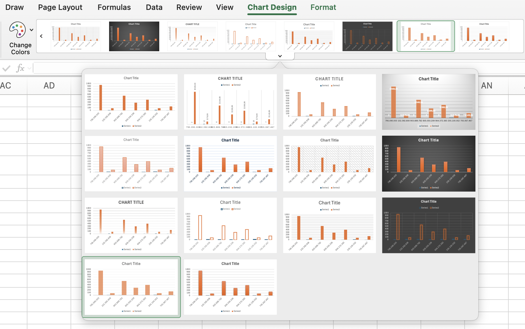
- Chart appearance can be customized from the Chart Design tab by selecting different Chart Styles and using Change Colors to apply a new color scheme;
- Additional formatting options are available in the Format tab, where Shape Styles can be applied to chart elements;
- Text elements can be enhanced using WordArt Styles to modify their style and color for better visual impact.
Thanks for your feedback!
Changing Chart Styles and Colors in Excel
Swipe to show menu
This lesson focuses on enhancing the visual appearance of Excel charts. You will learn how to adjust styles and colors, choose appropriate color schemes, and format individual chart elements to improve clarity and visual impact.
Key Points
- Chart appearance can be customized from the Chart Design tab by selecting different Chart Styles and using Change Colors to apply a new color scheme;
- Additional formatting options are available in the Format tab, where Shape Styles can be applied to chart elements;
- Text elements can be enhanced using WordArt Styles to modify their style and color for better visual impact.
Swipe to start coding
This is a free exploration exercise — no right or wrong answer here.
Try clicking on the charts and experimenting with their visual styles:
- Excel workflow: click the
Piechart →Chart Designtab → choose any chart style. - Platform workflow: click the
Piechart → click the button in the top-right corner of the chart → clickOpen chart panel→ open theSetuptab → in theThemessection choose any color theme.
See how each theme changes the look and feel of the chart.
 Switch to desktop for real-world practiceContinue from where you are using one of the options below
Thanks for your feedback!
Ask AI

Ask AI

Ask anything or try one of the suggested questions to begin our chat
