Notice: This page requires JavaScript to function properly.
Please enable JavaScript in your browser settings or update your browser.
Kdeplot | Distributions of Data
Deep Dive into the seaborn Visualization
course content

Course Content

Deep Dive into the seaborn Visualization

Deep Dive into the seaborn Visualization

1. Light Start
2. Distributions of Data
3. Categorical Plot Types
4. Matrix Plots
5. Multi-Plot Grids
6. Regression Models

Kdeplot

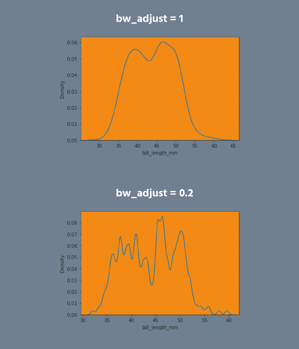
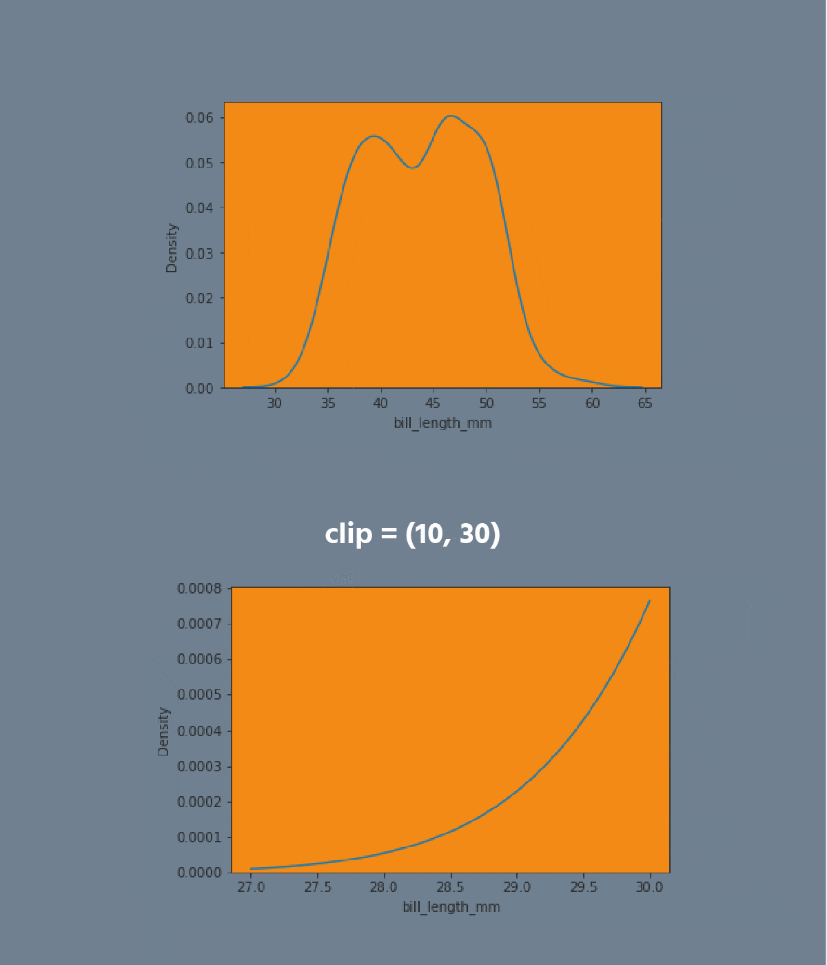
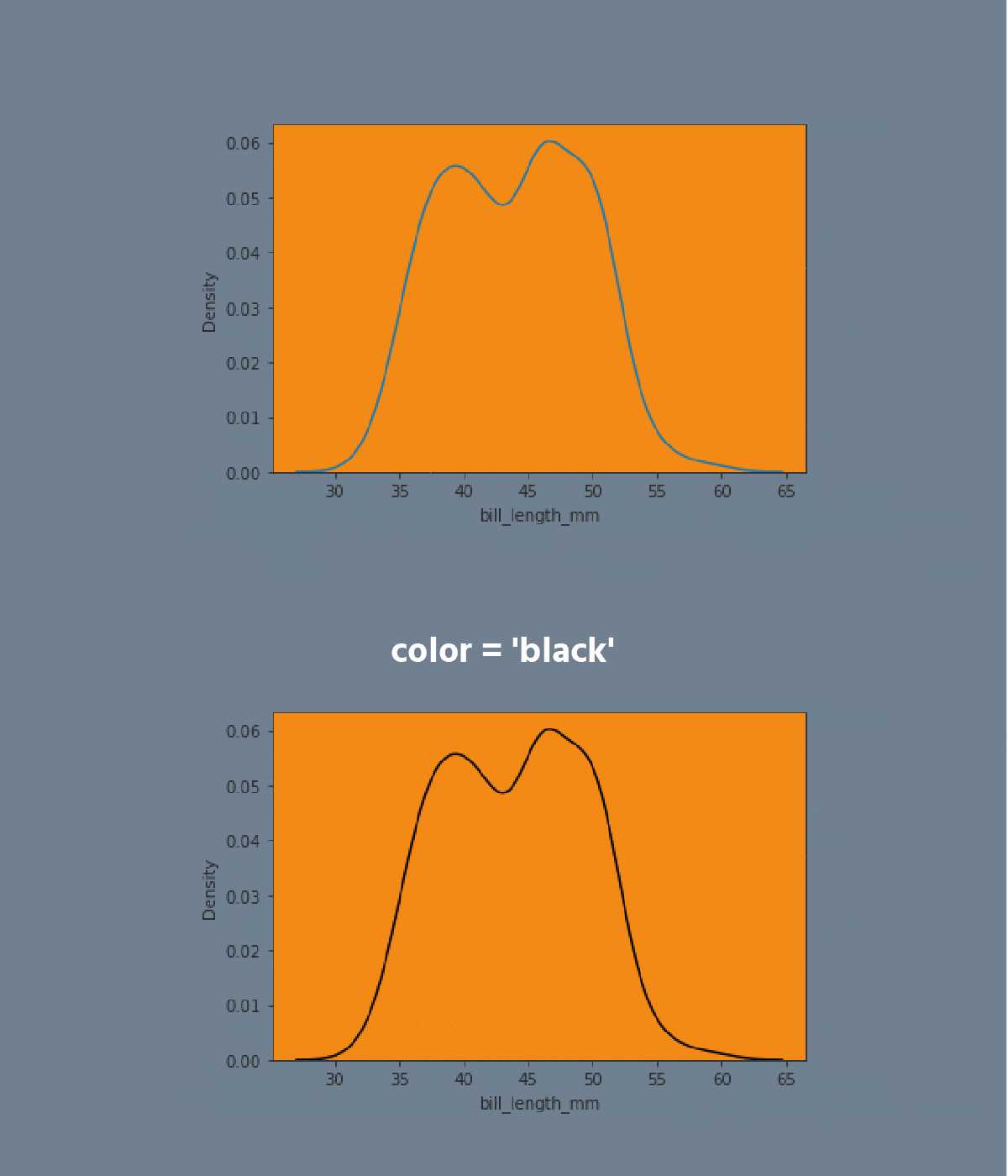
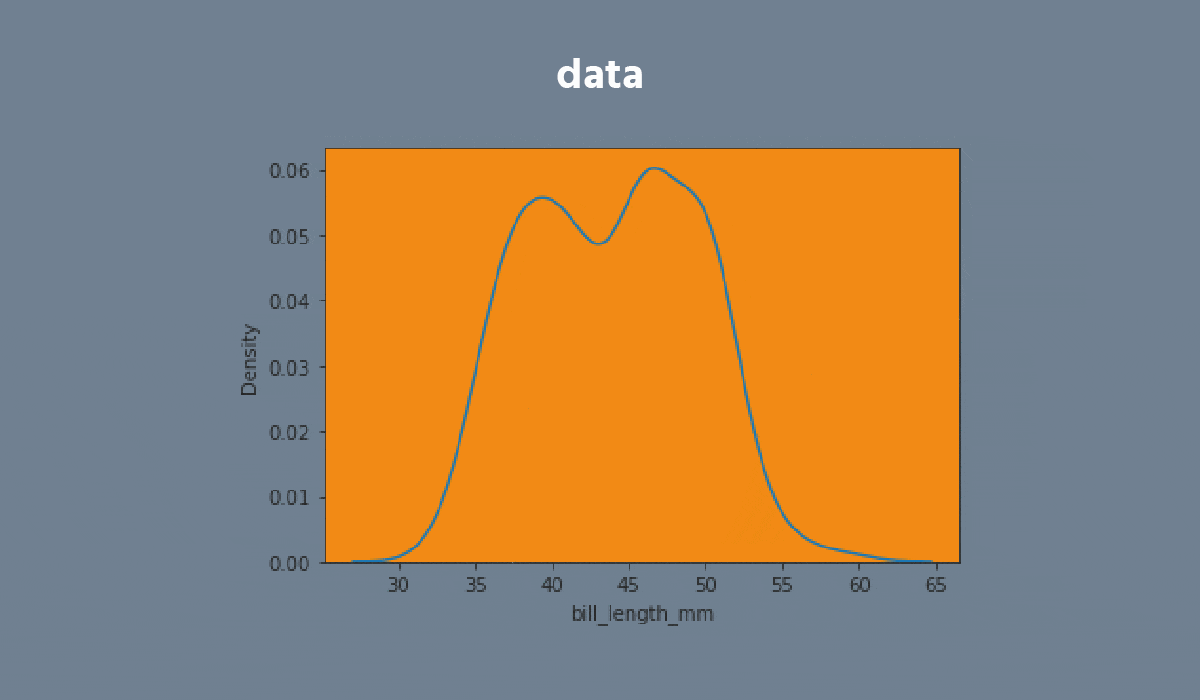
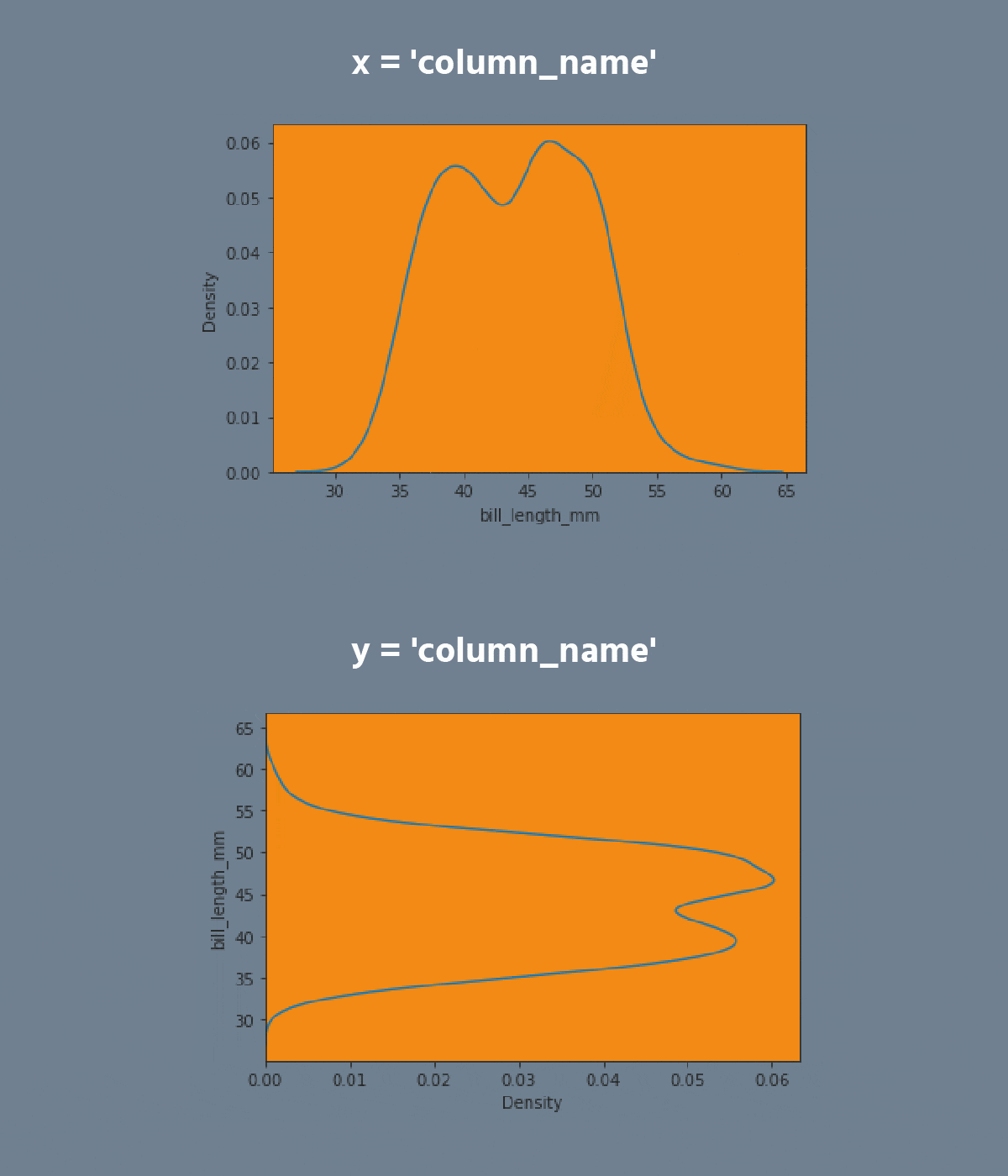
A kdeplot plot is a method for visualizing the distribution of observations in a dataset analogous to a histogram. KDE represents the data using a continuous probability density curve in one or more dimensions.
carousel-imgcarousel-imgcarousel-imgcarousel-imgcarousel-imgcarousel-imgcarousel-imgcarousel-imgcarousel-imgcarousel-imgcarousel-imgcarousel-imgcarousel-imgcarousel-imgcarousel-img

Task

  1. Create the kdeplot using the seaborn library:
  • Set the x parameter equals the 'max_temp';
  • Set the hue parameter equals the 'month';
  • Set the multiple parameter equals the 'stack';
  • Disable the legend;
  • Add the filling;
  • Set the data;
  • Display the plot.

Task

  1. Create the kdeplot using the seaborn library:
  • Set the x parameter equals the 'max_temp';
  • Set the hue parameter equals the 'month';
  • Set the multiple parameter equals the 'stack';
  • Disable the legend;
  • Add the filling;
  • Set the data;
  • Display the plot.

Everything was clear?

Section 2. Chapter 2
toggle bottom row

Kdeplot

A kdeplot plot is a method for visualizing the distribution of observations in a dataset analogous to a histogram. KDE represents the data using a continuous probability density curve in one or more dimensions.

carousel-imgcarousel-imgcarousel-imgcarousel-imgcarousel-imgcarousel-imgcarousel-imgcarousel-imgcarousel-imgcarousel-imgcarousel-imgcarousel-imgcarousel-imgcarousel-imgcarousel-img

Task

  1. Create the kdeplot using the seaborn library:
  • Set the x parameter equals the 'max_temp';
  • Set the hue parameter equals the 'month';
  • Set the multiple parameter equals the 'stack';
  • Disable the legend;
  • Add the filling;
  • Set the data;
  • Display the plot.

Task

  1. Create the kdeplot using the seaborn library:
  • Set the x parameter equals the 'max_temp';
  • Set the hue parameter equals the 'month';
  • Set the multiple parameter equals the 'stack';
  • Disable the legend;
  • Add the filling;
  • Set the data;
  • Display the plot.

Everything was clear?

Section 2. Chapter 2
toggle bottom row

Kdeplot

A kdeplot plot is a method for visualizing the distribution of observations in a dataset analogous to a histogram. KDE represents the data using a continuous probability density curve in one or more dimensions.

carousel-imgcarousel-imgcarousel-imgcarousel-imgcarousel-imgcarousel-imgcarousel-imgcarousel-imgcarousel-imgcarousel-imgcarousel-imgcarousel-imgcarousel-imgcarousel-imgcarousel-img

Task

  1. Create the kdeplot using the seaborn library:
  • Set the x parameter equals the 'max_temp';
  • Set the hue parameter equals the 'month';
  • Set the multiple parameter equals the 'stack';
  • Disable the legend;
  • Add the filling;
  • Set the data;
  • Display the plot.

Task

  1. Create the kdeplot using the seaborn library:
  • Set the x parameter equals the 'max_temp';
  • Set the hue parameter equals the 'month';
  • Set the multiple parameter equals the 'stack';
  • Disable the legend;
  • Add the filling;
  • Set the data;
  • Display the plot.

Everything was clear?

A kdeplot plot is a method for visualizing the distribution of observations in a dataset analogous to a histogram. KDE represents the data using a continuous probability density curve in one or more dimensions.

carousel-imgcarousel-imgcarousel-imgcarousel-imgcarousel-imgcarousel-imgcarousel-imgcarousel-imgcarousel-imgcarousel-imgcarousel-imgcarousel-imgcarousel-imgcarousel-imgcarousel-img

Task

  1. Create the kdeplot using the seaborn library:
  • Set the x parameter equals the 'max_temp';
  • Set the hue parameter equals the 'month';
  • Set the multiple parameter equals the 'stack';
  • Disable the legend;
  • Add the filling;
  • Set the data;
  • Display the plot.

Section 2. Chapter 2
Switch to desktop for real-world practiceContinue from where you are using one of the options below
We're sorry to hear that something went wrong. What happened?
some-alt