single
Pair Plot
Swipe to show menu
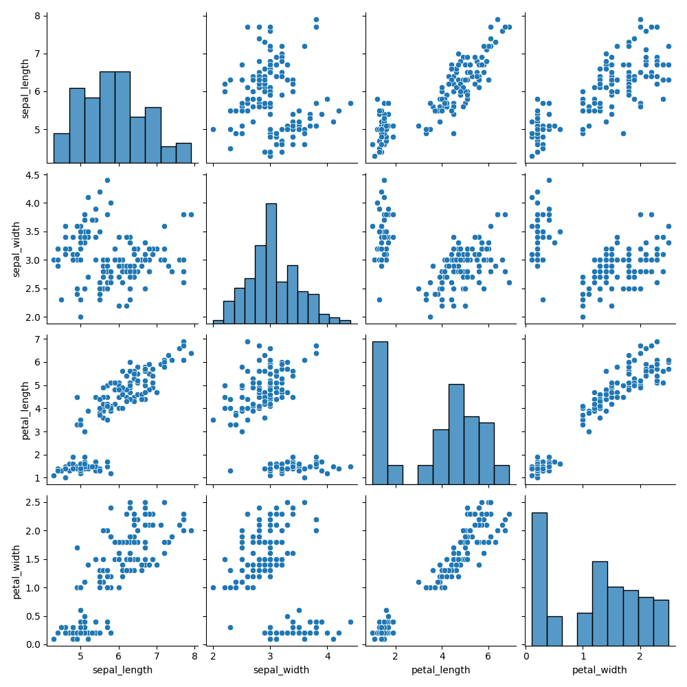
A pair plot visualizes pairwise relationships between all numeric variables in a dataset. Unlike a joint plot, it is not limited to two variables. It creates an N×N grid of subplots, where N is the number of numeric columns in the DataFrame.
Pair Plot Description
Each column in the grid shares the same x-axis variable, and each row shares the same y-axis. The diagonal displays histograms of individual variables, while off-diagonal cells show scatter plots.
Creating a Pair Plot
You can create one using seaborn.pairplot(). Its only required argument is data, which must be a DataFrame. Parameters like height and aspect set the size (in inches) of each subplot.
12345678910import seaborn as sns import matplotlib.pyplot as plt # Loading the dataset with data about three different iris species iris_df = sns.load_dataset('iris') # Creating a pair plot sns.pairplot(iris_df, height=2, aspect=0.8) plt.show()
Hue
The hue parameter assigns colors based on a specified categorical column. This highlights group differences and, when used in classification datasets, shows how classes separate across variable pairs.
With hue set (e.g., to species), the scatter plots color points by class, and diagonal plots switch from histograms to KDE plots, making class distributions clearer.
1234567891011121314import seaborn as sns import matplotlib.pyplot as plt # Ignoring warnings import warnings warnings.filterwarnings('ignore') # Loading the dataset with data about three different iris species iris_df = sns.load_dataset('iris') # Setting the hue parameter to 'species' sns.pairplot(iris_df, hue='species', height=2, aspect=0.8) plt.show()
Changing Plot Kinds
You can customize both the main and diagonal plots.
kindcontrols the off-diagonal plots (default:'scatter');diag_kindcontrols the diagonal (histogram or KDE, often chosen automatically whenhueis used).
12345678910import seaborn as sns import matplotlib.pyplot as plt # Loading the dataset with data about three different iris species iris_df = sns.load_dataset('iris') # Setting the kind parameter and diag_kind parameters sns.pairplot(iris_df, hue='species', kind='reg', diag_kind=None, height=2, aspect=0.8) plt.show()
'scatter', 'kde', 'hist', 'reg' are possible values for the kind parameter.
diag_kind can be set to one of the following values:
'auto';'hist';'kde';None.
Everything is similar to the jointplot() function in this regard.
Explore more in the pairplot() documentation.
Swipe to start coding
- Use the correct function to create a pair plot.
- Set the data for the plot to be
penguins_dfvia the first argument. - Set
'sex'as the column which will map the plot aspects to different colors via specifying the second argument. - Set the non-diagonal plots to have a regression line (
'reg') via specifying the third argument. - Set
heightto2. - Set
aspectto0.8.
Solution
Thanks for your feedback!
single
Ask AI
Ask AI

Ask anything or try one of the suggested questions to begin our chat
